At this point in the redesign process the mobile layout and design is (mostly) complete. The next stage of the process is to look at "non-mobile" designs.
Again I am going to take a typography-first approach. What this means is looking at the font size, measure, etc. at different browser widths and trying to maintain a nice reading experience as the width increases.
Responsive Breakpoints
A response design breakpoint is that point where one set of CSS styles takes over from another. Each breakpoint represents potentially different layout, styling, content and functionality. Responsive breakpoints are implemented using CSS3 media queries that enable a different set of CSS to be applied depending on the size of the window.
A response design breakpoint is that point where one set of CSS styles takes over from another.
As I am thinking typography-first, I will let the breakpoints occur naturally where they arise rather than designing up front. I'll be doing in-browser design rather that mockups in a drawing or prototyping application.
A good guide (see below for recommended tools) for the different resolutions is the Chrome Window Resizer plugin.
Will it Look Good on an iPad?
It's not a good idea to think of individual devices because we don't want to have device-specific renderings; this is not sustainable or maintainable: every time a new device is released we would have to create a breakpoint for it.
If the user has a browser that supports media queries then we can write CSS specifically for certain situations
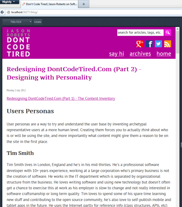
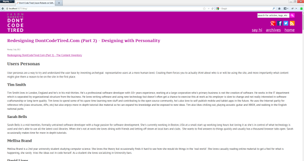
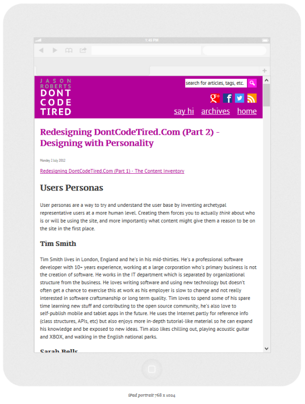
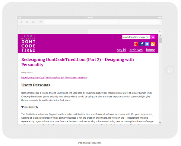
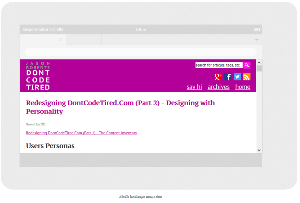
We can however look at the resolution of an iPad (for example) and add this to the Window Resizer plugin to give us another useful reference point. I have added a 1024 x 768 (iPad landscape) and 768 x 1024 (iPad portrait).
Arranging the CSS (SASS)
Currently I have a 0-up.scss SASS file that generates a 0-up.css file. This is being included and is not surrounded by a conditional media query. This means that these styles will always be used, unless they are overridden by styles that occur later in the CSS.
The styles that are specified later on will be surrounded by media queries that represent the responsive breakpoints in the design.
The First Responsive Breakpoint at 768px
At 768 pixels wide the measure (of the text) is still nice as is the font size. The thing that I want to introduce at this breakpoint is a change in the header.
I want to replace the drop-down select box with simple hyperlinks. I also want to add the search box into the header.
Creating a Breakpoint Using CSS Media Queries
The first thing we need to do is create a new (SASS) stylesheet to represent the styles that will be overridden, i.e. 768-up.scss.
The first thing in this stylesheet is to create the media query:
@media all and (min-width: 768px){
}
Weirdly, the Chrome Window Resizer seems to incorrectly report the width so at 768px the media query didn't kick in (I testing this by adding html { background-color: black;} and using the plugin to change to 768px, but the background was still white.
Some other tools I tried:
Hiding the Drop Down Select Menu
In the 768-up file:
@media all and (min-width: 768px){
#menuNavSelect{
visibility: hidden;
display: none;
}
}
Showing the Hyperlink Navigation
In the 768-up file:
@media all and (min-width: 768px){
#menuNavSelect{
visibility: hidden;
display: none;
}
#menuNavList {
visibility: visible;
display: block;
}
}
Showing the Search Box
It's at this point that the idea of having multiple SASS files to represent the breakpoints becomes problematic. The problem is that if we want to use any of the mixins or variables that are defined in the 0-up.scss file we would have to copy and paste them creating a maintenance overhead.
There is an import rule is SASS that can import another .scss file but it looks like it imports as plain CSS if there are any media queries.
So rather that have separate SASS files for each breakpoint, I've decided to have one SASS file, inside which all the media queries will be defined.
To show the search box, in the 768-up section of the scss file we add some styling for headerSearchContainer:
@media all and (min-width: 768px){
#menuNavSelect{
visibility: hidden;
display: none;
}
#menuNavList {
visibility: visible;
display: block;
}
#headerSearchContainer {
visibility: visible;
display: block;
}
}
These are the only changes I want to make at this breakpoint. I may makes some tweaks later, but for now this is fine.
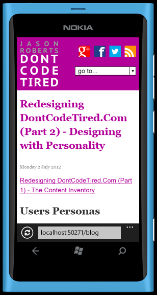
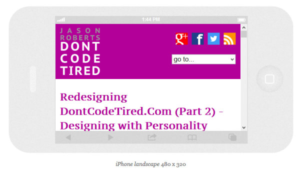
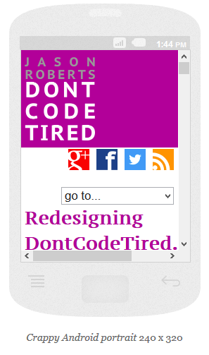
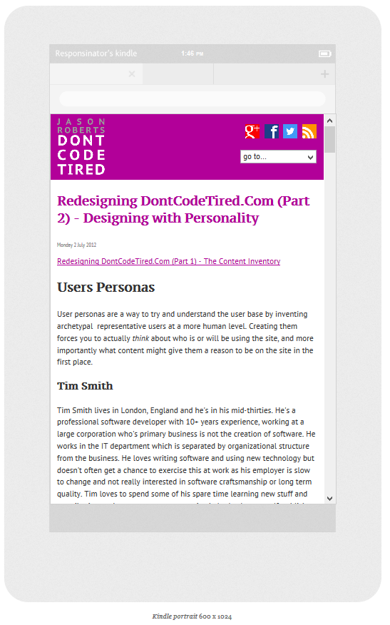
Screenshots from the awesome Responsinator:
SHARE: