Creating the Second Responsive Breakpoint
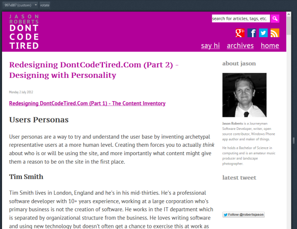
The next responsive breakpoint kicks in at 970px width. At this point the first of the sidebars become visible. This "about me" sidebar contains a basic bio and the last tweet I made, in addition to some advertisement space.
The tone of this sidebar is muted (other than the ads) with grey text and a black and white bio photo so as not to detract too much from the main article content.
I think the measure (length of horizontal line of text) becomes a little long before this break point kicks in, but is an acceptable compromise.
Creating the Third Responsive Breakpoint
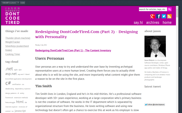
The third breakpoint kicks in at 1200px. It introduces the second of the sidebars on the left side.
This sidebar contains common blog-type widgets such as tag clouds and links. Again the text is muted so as to not detract too much from the main content.
Defining a Maximum Width
As the width continues out from the third breakpoint the measure becomes increasingly long. Left unchecked the readability quickly becomes poor as the eye has a long way to travel from the end of one line on the right to the start of the next line on the left.
At some point a maximum point is reached where the text should no longer expand. This point occurs at 1470px, which still allow a pretty long measure but again is somewhat of a compromise. This is defined in the CSS using:
html {
max-width: 1470px;
}
At some point I might make the whole body centre aligned but for now I'm ok with this.
Using SASS to Style Tag Cloud Text Sizes
The blogging engine I'm using renders the tag cloud by adding classes to the items depending on the prominence of those tags in posts. Whilst I could have simply hard-coded the font sizes in these, it looked like a good opportunity to use SASS.
First I defined a couple of SASS variables, one to set the base font size for the least frequent tags, another to set what the increment is between each size. Then it's just a matter of multiplying the base size by a multiple of the increment. This enabled me to play with different combinations really quickly to get the look I wanted.
The final chuck of SASS looked like this:
$tcBaseSize: 0.5;
$tcIncrement: 0.3;
.tagcloud a.biggest {
@include font-size($tcBaseSize + (4 * $tcIncrement));
}
.tagcloud a.big {
@include font-size($tcBaseSize + (3 * $tcIncrement));
}
.tagcloud a.medium {
@include font-size($tcBaseSize + (2 * $tcIncrement));
}
.tagcloud a.small {
@include font-size($tcBaseSize + (1 * $tcIncrement));
}
.tagcloud a.smallest {
@include font-size($tcBaseSize);
}
Styling the Bullet Points in Unordered Lists
I wanted to change the bullet points from the default black circle to a coloured square as a nice visual embellishment.
The problem is that other than using images for bullets, this can be hard to do in CSS. Also I needed the solution to work with all the old posts that used unordered lists.
The solution I came up with (whilst a bit of a hack) seems to work nicely with the above constraints.
The solution involves using some jQuery to find all the <li> elements, and inject a <span> to wrap the inner content. This span has an inline style applied to set the colour to the that used by the rest of the article copy.
function wrapListItemContent() {
var standardTextColor = $("#hiddenTextColorJQueryHook").css("color");
$("ul li").each(function () {
var t = $(this);
t.html('<span style="color: ' + standardTextColor + '">' + t.html() + "</span>");
});
}
The hiddenTextColorJQueryHook is an element that I inject whatever SASS colour variable I'm using, so that if I change the SASS colours there will be no change required in the JavaScript.
The downside of this approach is the bullet points and text will appear coloured until the jQuery document ready fires. I may decide to pull this once I get into final device testing.
Screenshots of the New Breakpoints
SHARE: