Redesigning DontCodeTired.Com (Part 2) - Designing with Personality
This step is all about deciding what content will go where, and more importantly what content will be removed when viewed on mobile or tablet devices.
I could use an image editor (Photoshop, Inkscape, Paint.Net, etc) to create some wireframes and decide what content to put in them.
An alternative is to do in-browser design. This means actually creating the wireframes using HTML and CSS. The advantage of this is that I can iterate really quickly through designs and actually view the wireframes in the browser or mobile emulator. By using CSS 3 media queries I can experiment with mobile and tablet wireframes early on to get a feel for the final implementation in the actual target technology (HTML & CSS) rather than having to translate from a bitmap (Photoshop, etc.) at a later date.
As a starting point and with 'mobile first' and 'progressive enhancement' in mind, the first wireframe is a simple linear design where the majority of content flows from top to bottom. The value of starting with the most basic, most simple, linear design is that it forces us to concentrate on the most 'accessible', mobile-friendly version first. Once this is done we can add extra content for non-mobile/desktop resolutions.
Initially I tried using markup (using Pandoc) but found it wasn't adding much value, so switched to just writing the HTML manually.
I am using SASS to make writing the CSS a bit easier using the SASS command line. You could also use Visual Studio with the awesome (and free) Web Workbench for the SASS compilation.
(SASS is an way of writing CSS at a slightly higher abstraction layer and allow variables for repeated values etc. or in their words: "Sass makes CSS fun again")
Stop in the Name of love Text
I got as far as an initial wireframe for mobile and a design for 800px width screen then I started to read about the ideas of "typography first" and "content-out, not canvas-in" approaches. As I want the content (text) to be the most important thing in the redesign, I decided to not do any more work on the content reference wireframes at this point.
A future step will be to start with some sample content and figure out how the typography will affect the layout and where the responsive breakpoints will naturally occur when taking into account measure, leading, font size, etc.
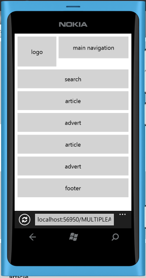
The image below show a content reference wireframe for the multiple posts page (as viewed in the Windows Phone emulator).
SHARE: