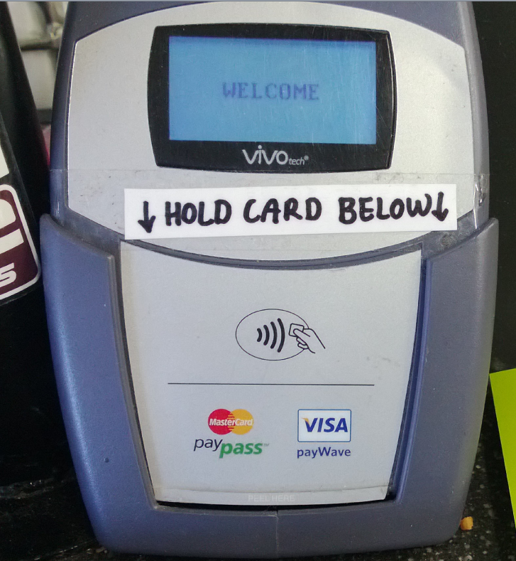
Take a look at this photo I took of a contactless style of payment terminal at a local grocery store. This is the kind of terminal that, with a compatible credit/debit card you can just tap, hover, or wave you card in front of the machine rather than inserting and keying in a pin number.
Notice the extra handwritten instruction taped to it: “HOLD CARD BELOW”.

The fact that the staff of the store had to modify the machine in this way gives us a clue that there may be a problem with the design. It suggests that some customers were holding their cards in the wrong place, perhaps at the top of the machine, and thus not initiating a payment.
We can see that the only perceived affordance of where to hold your card is the little diagram in the middle.
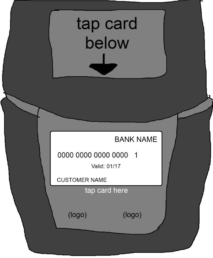
Whilst I’m not a hardware designer (and without perhaps performing some usability studies) I thought it would still be fun to mock-up some changes.
In this (unashamedly) low-fi sketch I’ve made two changes.

The first is to replace the small diagram in the middle with a “picture” of an dummy card, also some instructional text “tap card here” has been placed below. The idea here is to suggest that “your card goes here”, re-enforced by the instruction.
The second change is to the text output in the digital LCD display at the top. I didn’t notice what this said when a payment was pending, but when not pending it simply says “welcome”; which is nice but not instructional in any way. By having this message more instructional in nature, and also increasing the size of the text (with pointing arrow) it might make it clearer to the customer where they should be looking.
Whether these changes would actually improve usability is unknown, but it’s fun to notice these things in the real world and play with ideas. These changes would possibly appear to be not as “pretty” but if the design goal was to “eliminate customers needing to ask the cashier for help” then this might be an acceptable trade-off.
If you want to learn more about design principals and related things such as Typography and colour choice, feel free to check out my Pluralsight Introduction to Design course.
(PayPass is a trademark of MasterCard International Incorporated. Visa payWave is a registered trademark of Visa Worldwide Pty Limited. All other marks or registered trademarks are the marks or registered trademarks of their respective owners)
SHARE: