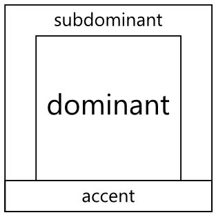
One way of thinking or planning colour is to think in terms of relative expansiveness, that is, the proportion of the use of different colours.
One way to describe this proportionality is to think in 3 groups:
- The Dominant Colour: proportionally the largest expanse of colour, e.g. the ground
- The Subdominant (or subordinate) Colour : the second largest expanse of colour after the dominant
- The Accent Colour: the colour with the smallest relative area
This doesn’t mean that we can only ever use just three colours, but it’s a nice conceptual model. We could, for example, have a single dominant colour and a single accent colour; but we might have 3 shades of a subdominant to create a greater range of visual possibilities.
A simple way to visualise this is to use a subdivided coloured square.
We simply divide a square into the 3 areas as shown here:

We can then plug colours into each component to start to get an idea of how they might work together…
For example, we can take inspiration from an existing palette such as one on Kuler. In this next example I’ve plugged in some colours from the Phaedra scheme.

We can start to image the relationships now between the proportions.
This next example is based on the Neutral Blue scheme:

Again we can quickly start to judge whether the colours feel right, if the accent colour will give enough contrast (for example accent coloured text on subdominant ground), etc.
If you want to learn more about colour choice and other design related things such as Typography, feel free to check out my Pluralsight Introduction to Design course.
SHARE: